- 0
- 0
- 0
分享
- 【原创】武林路9号咖啡品牌形象设计/Wake Town Coffee Brand Image Design
-
2022-08-08
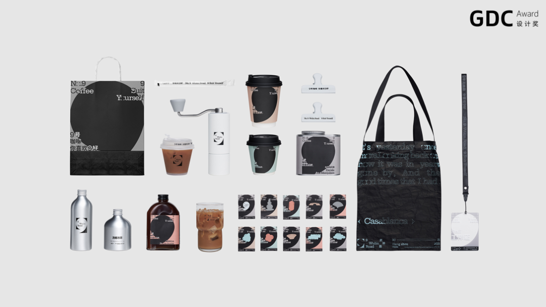
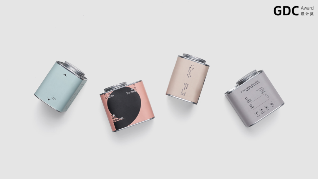
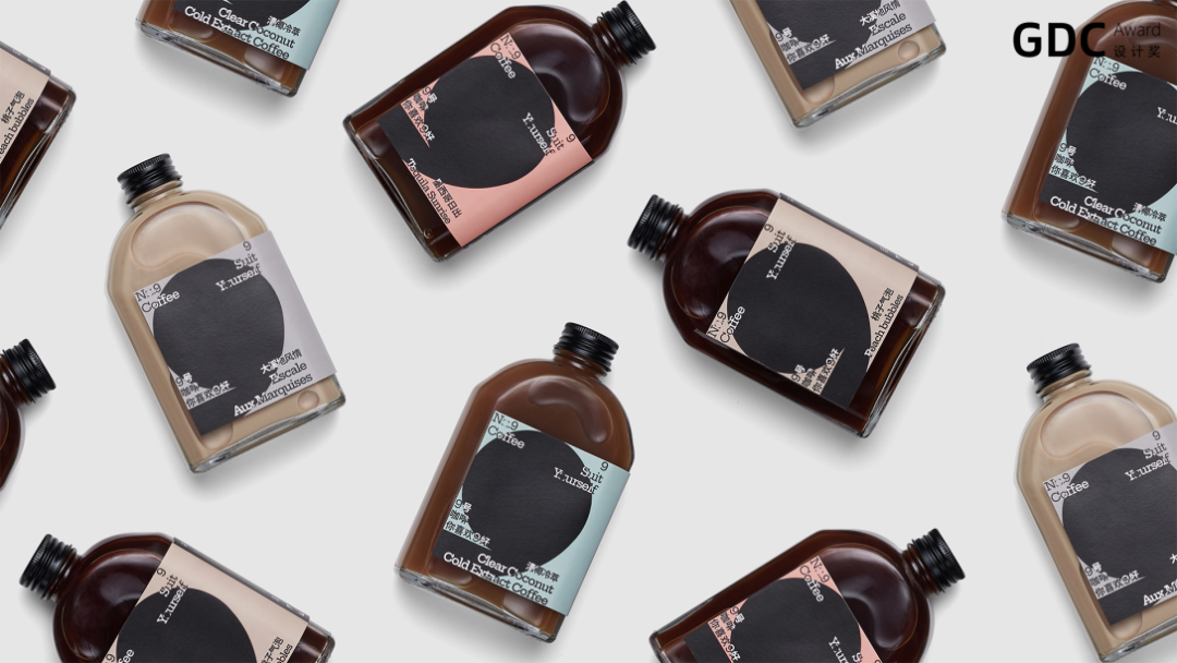
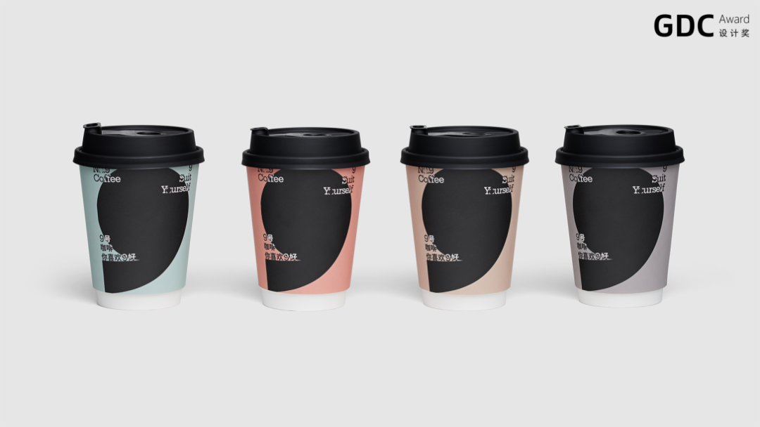
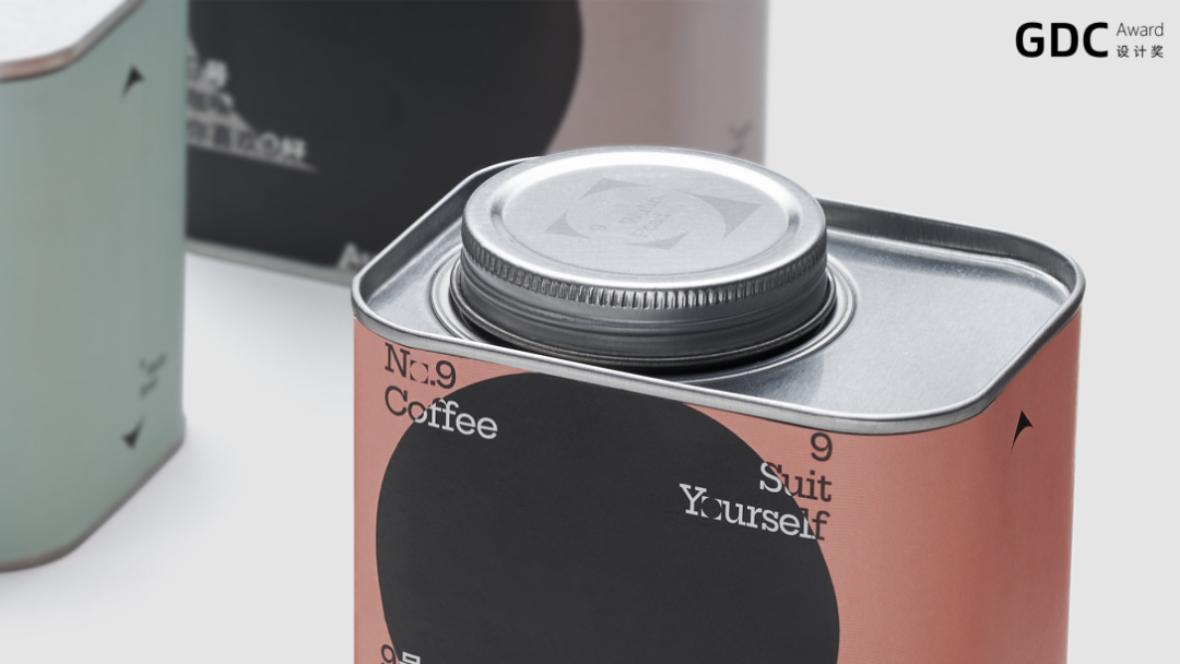
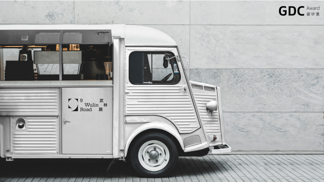
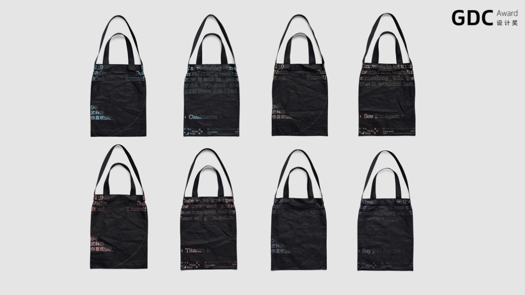
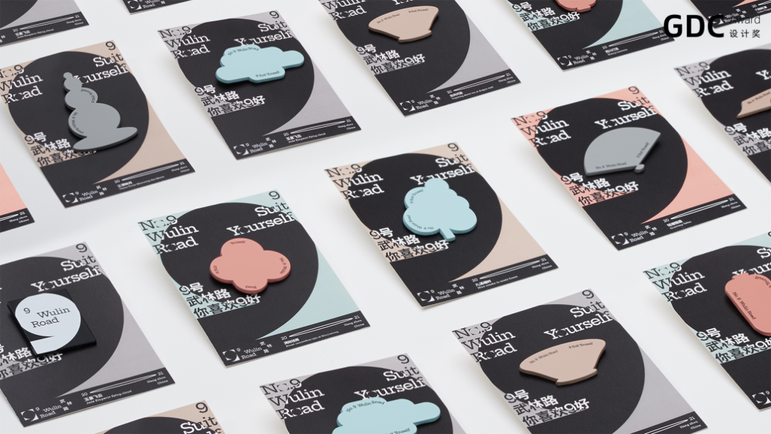
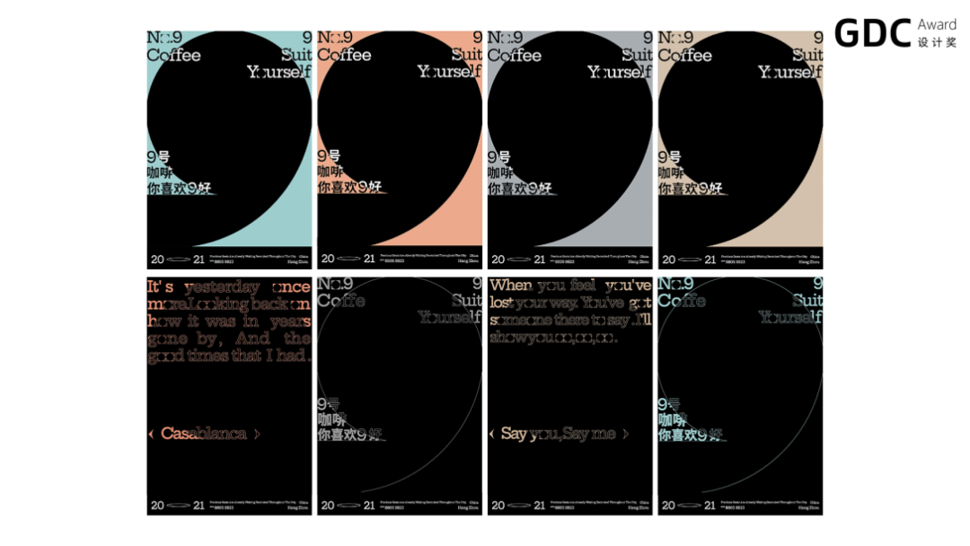
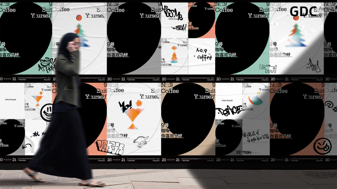
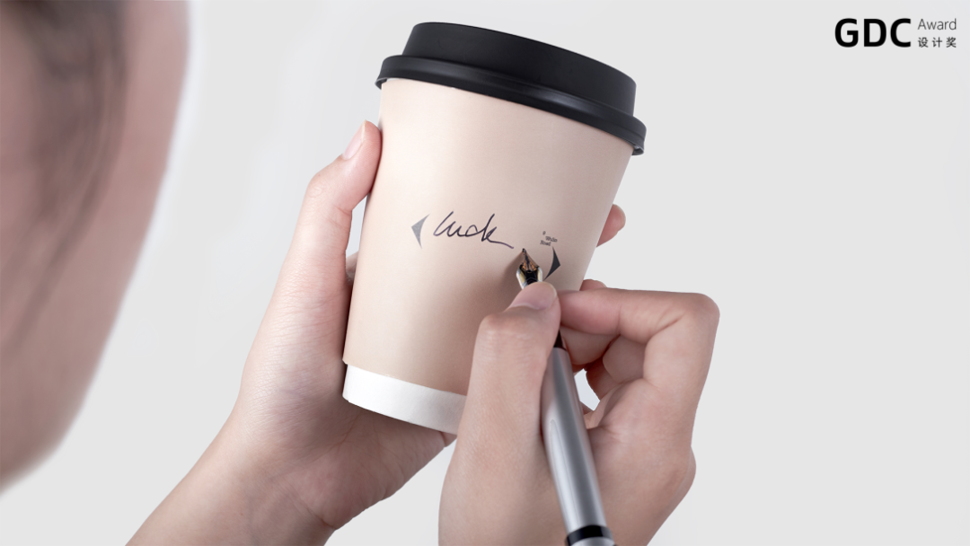
这个咖啡厅所在的地理位置就叫武林路9号,所以创作中直接从名字中提炼最快识别的数字符号“9”来做为我们的切入点。本项目恰恰又在中国最美天堂西湖边上,一轮明月照在湖面上的暇意瞬间找到了思路,我们直接用圆形在正方形之间找到了“9”的关系,非常直接巧妙的设计出了LOGO主图形,极简的设计感且识别度很高。这个“9”的图形就像俯瞰的正如一本咖啡放在托盘上的感觉。后续我们在此输出了“你喜欢9好”的品牌slogan,所以“9”符号在后续的品牌形象延展中我们在不同的物料中尝试图形各种组合成为抽象的人物,饮品等等系列海报及衍生品,其中在各种衍生品及物料上我们留有消费者参与填写的空白处,这也是我们所希望做一个非常直接的LOGO设计在后续的延展中能与消费者之间产生有趣的互动。消费者可以在空白处任意填写他们喜欢的述求,与“你喜欢9好”完美结合。
让消费者拥有新鲜体验的同时也强化了消费者对品牌的忠诚度。这或许,才是品牌的终极目标。
-
With the rise of Gen Z and experiential retail, the main audience for the design are the young, trendy people who are now the most enthusiastic consumers. That’s why we are creating a youthful image for the coffeehouse.
The coffeehouse is located at what is known as the Wake Town, or “No. 9 Wulin Road” in literal translation, so we borrowed the most recognizable symbol in the name – the number “9” – as our starting point. This project happens to enjoy the privilege of being on the edge of China’s most beautiful paradise – the West Lake. In a moment of leisurely elation under a bright moon shining on the surface of the lake, we were blessed with an inspiration: an interesting relationship between the circle and the square is found in the number “9”, and a very direct and ingenious design for the LOGO’s core shape is created, featuring a minimalist design sense and high recognizability. The graphics of the “9” shape looks like a cup of coffee on a tray in an overhead view. From the same concept we later developed the brand slogan “It’s N9ce If You Like It”, and the symbol of “9” was consistently used in the subsequent extension design of the brand image. We experimented with combining various shapes of different materials into abstract representations of human figures, drinks, etc., that are used on a series posters and derivative works, on which we leave blank spaces for customer to write their messages. This is why we want to do a very direct LOGO design, which in subsequent extension can offer room for interesting interactions with consumers, who can fill in the blank with any statements they like, which is a perfect combo with the slogan “It’s N9ce If You Like It”.
To give consumers a fresh experience and deepen their loyalty to the brand at the same time, this is perhaps the ultimate goal of brand building.
-
阅读原文
* 文章为作者独立观点,不代表数艺网立场转载须知
- 本内容由数艺网主动采集收录,信息来源为 “古田路9号” 公开网络发布内容。第三方如需转载本内容,必须完整标注原作者信息及 “来源:数艺网”,严禁擅自篡改、删减或未标注来源转载。 并附上本页链接: 若您的内容不希望被数艺网收录,或认为此举侵犯了您的合法权益,敬请通过微信 ID:d-arts-cn 联系数艺网。我们将致以诚挚歉意,并第一时间为您办理下架或删除处理。
