- 0
- 0
- 0
分享
- CAFA专访国际奥委会顾问:从雅典到北京的奥运设计之旅|Interview with Theodora Mantzaris
-
原创 2022-03-30
Editor's Note: Beijing has officially become the first “Dual Olympic City” after the Beijing 2022 Winter Olympics and Paralympic Games were successfully held. In addition to the deep impression that athletes have left on the spectators across the world, the Olympic design project worldwide with unparalleled media coverage once again illustrated the significant role that great design played.
As it is widely known, each Olympic Games has its own character which reflects the influence of the people, culture and history of the host city and country, what’s triggering off our interest are how Olympic design project of the Beijing 2022 Winter Olympic Games works and develops with the supervision of the Organizing Committee for the Olympic Games (OCOG), to what extent it can be regarded as a successful one and the future influence it may exert on designers. We were honored to have input from Ms. Theodora Mantzaris, an IOC advisor from OCOG who supervised the design teams for Beijing 2008 Olympic Games and Beijing 2022 Winter Olympic Games and she shared with us her comprehension, thinking and experience from the perspective of Olympic design history. Theodora Mantzaris is the world’s leading Design Director for major sporting events. She led the design team of the Athens 2004 Olympic Games and she became the Design Advisor to the International Olympic Committee on all subsequent Olympic Games. Throughout her career, Theodora has been recognised for her accomplishments. Educated at the world’s top design institution, the Royal College of Art in London, she completed executive leadership coursework at Harvard University and she has also studied at Guildhall University, Marketing (Chartered Institute of Marketing).
编者按:自北京2022年冬奥会和冬残奥会成功举办之后,北京正式成为了世界上首个“双奥之城”。除了参与冬奥会的世界顶级运动员们同场竞技给观众留下的深刻印象之外,冬奥视觉设计也伴随着无以伦比的媒体报道再次阐释了卓越设计所能发挥的重要作用。
众所周知,每届奥运会都拥有着自己的特色并反映了主办城市和主办国家的文化内蕴与历史发展的影响。全球运动品牌专家、国际奥委会顾问西奥多拉·玛莎里斯女士(Theodora Mantzaris)曾领导了雅典2004年奥运会的设计团队并随后成为了国际奥委会的设计顾问。她也曾受国际奥委会委托指导北京2008年奥运会和北京2022年冬奥会的中国设计团队,为此中央美术学院艺讯网也特别通过专访从奥运设计史的角度切入,邀请西奥多拉·玛莎里斯女士阐述她的理解、思考和经验。

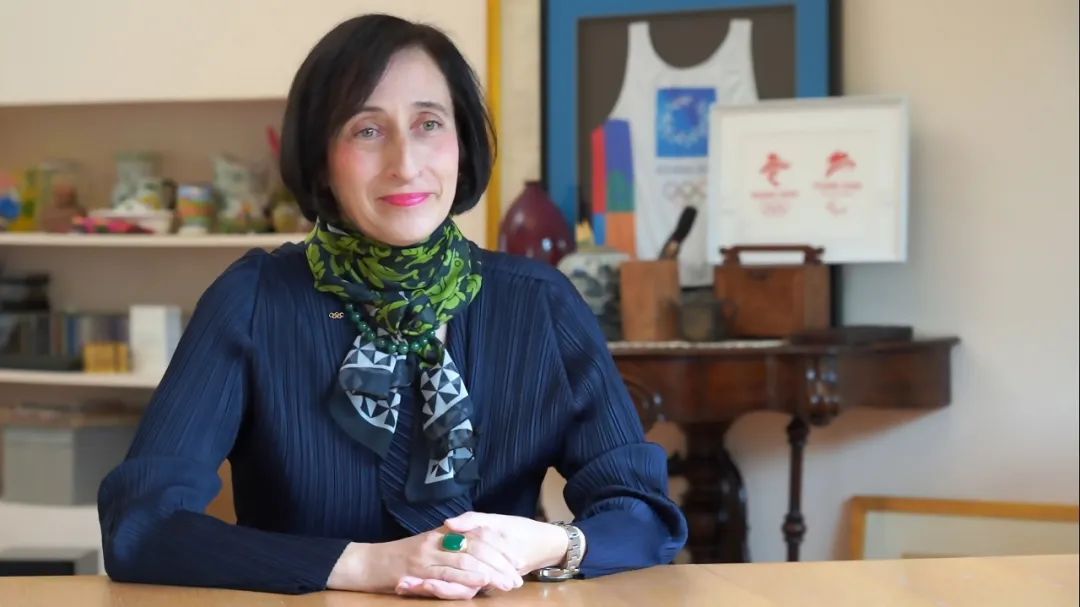
Interview Date/采访时间: February 26, 2022/2022年2月26日
Interviewee/受访人: Ms. Theodora Mantzaris/西奥多拉·玛莎里斯
Interviewer & Editor/采访、整理、编辑: Sue Wang/CAFA ART INFO(Q)
Photo Courtesy of Ms. Theodora Mantzaris
图片和相关资料致谢西奥多拉·玛莎里斯女士
Q
Being a designer for the visual identity of the Athens 2004 Olympic Games and later an IOC advisor, what do you think are the standards to adhere to in regard to the visual identity for the Olympic Games to be successful?
您曾担任雅典2004年奥运会的总视觉形象设计师并在后来成为了国际奥委会顾问,在您的工作中,您认为衡量奥运会视觉形象成功与否的标准是什么?
Theodora Mantzaris: The beauty of the Olympic Games is that each edition is taking place in a different part of the world. This is an opportunity for the Host Nation to project its distinctive national attributes while the values of Olympism are enriching the identity of the Nation.
The Olympic project is by default a “Branding the Nation” project. This was evident to me from the beginning of my work in the Athens 2004 Olympic Games. Prior to that position, I was working with Wally Olins in London, where I experienced first-hand his pioneering thinking. I was fortunate to work on his projects and transform his vision on paper creating the visual language of the projects we were working on together. Wally Olins is the identity expert who “invented” Place Branding. In the Wally Olins books one can read about the relevance and interconnectivity of all actions or inactions of a Nation that create the Identity of the Nation in the specific, targeted groups of people in the world. The Olympic Games is one of the most effective communication channels to promote the attributes of the Nation, a Nation that wants to reach the global Olympic audience of billions.
奥运会的美妙之处在于每一届奥运会都在世界上不同的城市举行。这是主办国展示其独特民族属性的绝佳机会,同时奥林匹克的价值观也丰富了主办国的身份识别性。
奥林匹克项目被默认为是代表“国家形象”的项目。自我在2004年负责雅典奥运会的设计工作后,这一点对我来说就非常明确。在此之前,我曾在伦敦与国际品牌大师沃利·奥林斯(Wally Olins)一起工作,我曾深刻地体验到他的开创性思维。我很幸运能够参与他的项目,并为我们共同努力的项目将他在纸上的愿景转化为创造视觉语言。沃利·奥林斯是“发明”区域品牌化的品牌专家。在沃利·奥林斯的著作中,人们可以读到关于对于世界上特定并有针对性的人群中创造国家形象的行为或无作为之间的相关性与相互联系。奥运会是宣传国家形象属性最为有效的传播渠道之一,因为奥运会能触及全球数十亿观众。
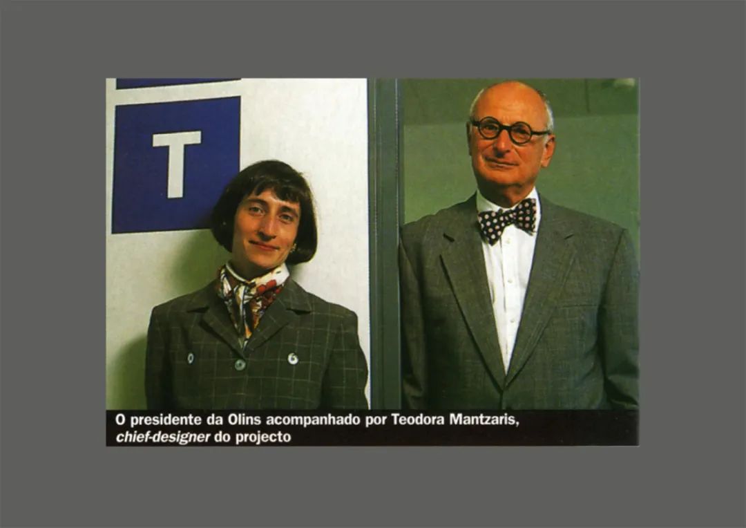
Theodora Mantzaris and Wally Olins
西奥多拉·玛莎里斯和沃利·奥林斯合影
In the book “Olympic Games – The Design” by Markus Osterwarlder, one can easily see the brilliance in design expressed in the Olympic Games visual identities. The visual identities that are most memorable are those that were led by competent designers who also had strong managerial skills. They also had the drive and commitment to deliver good design and at the same time knew how to empower the top management of the Organising Committee to embrace and approve the design proposals at hand.
在马库斯·奥斯特瓦德(Markus Osterwarlder)于2019年出版的《奥运会——设计》(Olympic Games – The Design)一书中,我们可以很便捷地看到奥运会视觉标识设计的卓越之处。最令人难忘的视觉形象是由具有强大管理能力并足以胜任的设计师们所引领的。他(她)们也有动力和承诺来提供好的设计,同时也知道如何使奥组委的高层管理人员们接受和批准手头的设计方案。
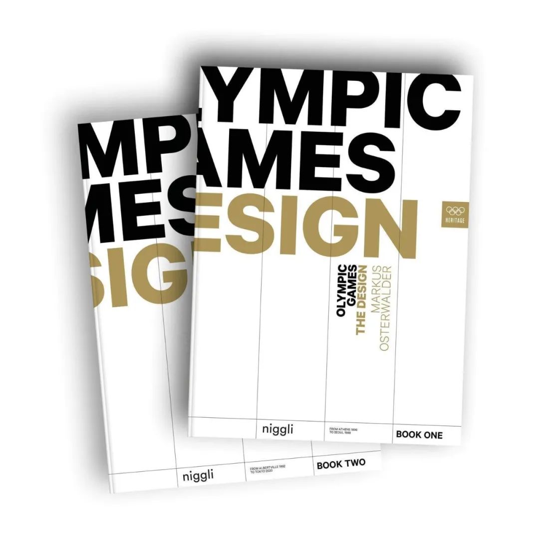
Olympic Games – The Design (2019) is the first book to focus in detail on the visual identities of all Olympic Games since Athens 1896.
《奥运会——设计》(2019)是第一本详细介绍自雅典1896年奥运会以来所有奥运会视觉形象的书籍。
Design and design alignment are key factors in the success of each Olympic Games edition. It is very common for OCOGs to waste a lot of time, even years, to finally understand the fact that the Designer or Creative Director is the one that has the power to deliver brilliance or failure depending on their ability. It is also very common for the Designer or Design Director in an OCOG to be very low in the hierarchy of the Organisation. In addition to that the IOC takes a neutral position on that matter. This is a limiting factor in the delivery of the visual identity and Look of the Games in so many editions of Olympic Games.
设计以及设计的系统性是评判每届奥运会设计成功与否的关键因素。(奥运会)设计师或创意总监的工作成功与否,往往奥组委会通过很长时间甚至数年来最终进行判定。奥组委的设计师或设计总监在整个组委会的层级结构中地位较低也是很常见的。除此之外,国际奥委会在这个问题上采取中立立场,这也是在许多届奥运会设计中限制视觉形象和奥运会景观传达的因素。
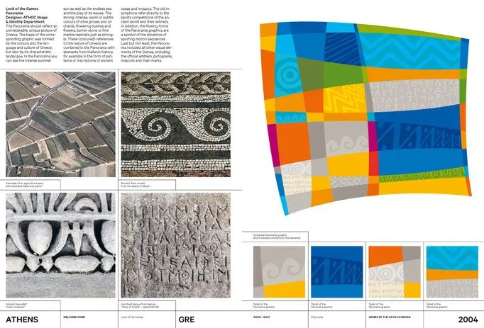
A page from Olympic Games – The Design
《奥运会——设计》中关于雅典2004年奥运会设计的页面
来源/Source: https://www.theolympicdesign.com/
The Olympic Games visual identity is the dream project of every graphic designer in the world. I am one of the privileged ones that made my dream come true. In the Athens 2004 Olympic Games I had the unique opportunity to handle every single project, so now I am in the position to say that every line drawn, was under my creative direction. I defined the vision and values, designed the Emblem, and built the Organising Committees inhouse team to deliver the plethora of projects required in this massive Olympic design project. I was also able to place the Image and Identity Department in the Office of the President. A position that is so important to the alignment of the identity delivery. In that way all Athens 2004 Organising Committee departments had to follow the central creative direction. As I mentioned before, this was a unique situation. It was unique because the ATHOC top management was ignorant of design issues but they were also very open to admit it so they entrusted the whole project to myself as the expert.
奥运会视觉形象设计是世界上每一位平面设计师都梦寐以求的项目。我是梦想成真的幸运者之一。在雅典2004年奥运会上,我有独一无二的机会来处理每一个项目,(雅典奥运会设计的)每一条线都是在我的创意指导下绘制的。我定义了愿景和价值观,设计了会徽,并组建了组委会内部团队,以交付这个庞大的奥运会设计项目所需的大量子项目。我还能够将形象和识别系统置于总统的办公室中(进行讨论和展示)。这样一来,2004年雅典奥组委的所有部门都必须遵循系统的创作方向。正如我之前提到的,这是独一无二的,因为雅典奥组委的高层管理人员对设计问题一无所知,但他们也非常愿意承认这一点,因此他们将整个项目委托给了我作为专家主理。
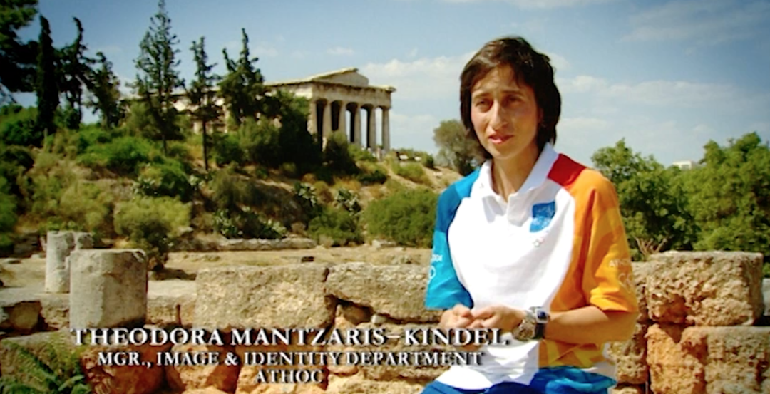
A Screenshot of Theodora Mantzaris in the Public Program for the Athens 2004 Olympic Games
西奥多拉·玛莎里斯在雅典2004年奥运会节目中的截图
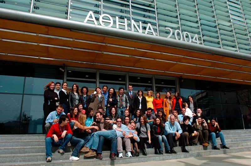
The Design Team Led by Theodora Mantzaris for the Athens 2004 Olympic Games
由西奥多拉·玛莎里斯领导的雅典2004年奥运会设计团队
After the Athens 2004 Olympic Games, China offered me the opportunity to embark on the journey to empower and support the designers under the creative leadership of Wang Min. This was a great honour for me and I treasure every minute I worked for the Chinese team. I am also very fortunate to be part of the Olympic Movement since the first day I was hired by the Athens 2004 Organising Committee and still work on all Olympic Games editions, including the Beijing 2022 Winter Olympic Games.
The Beijing 2022 Winter Olympic Games visual identity and Look of the Games is one of the most effective and creative in Olympic design history. A celebration of Olympism, by providing the perfect background to the athletes when in competition. The Chinese culture combined with the Olympic Rings are forming the most inspiring setting that sends a universal message of global unity and peace to the world. This is attributed to the power of good design and to a very strong Design Director: CAFA Professor Lin Cunzhen. Despite all odds (common to all Olympic Games) under her creative leadership, China presented one of the most culturally enhancing Olympic Games identity.
雅典2004年奥运会后,中国让我有机会再次踏上赋能和支持设计师团队的旅程,这对我来说是莫大的荣幸,我珍惜为中国团队工作的每一分钟。我也很幸运,自从我被2004年雅典奥组委聘用的第一天起,我就成为了奥林匹克运动的一员,并且仍在为所有奥运会设计项目工作,包括北京2022年冬奥会和冬残奥会。
北京2022年冬奥会的视觉形象和奥运会景观是奥运会设计史上最有成效和最具创意的设计之一。中国文化与奥运五环相结合,形成了最鼓舞人心的环境,向世界传递出全球团结与和平的共识,通过在比赛中为运动员们提供完美的背景来弘扬奥林匹克精神。这要归功于卓越设计的力量,也归功于一个非常强大的设计总监:中央美术学院的林存真教授。在她的领导下,尽管面临了困难重重(所有奥运会都是如此),但中国展现了最具文化意义的奥运会形象之一。
Q
You had been invited to work with the design team led by Professor Wang Min for the Beijing 2008 Olympic Games and the later one led by Professor Lin Cunzhen for the Beijing 2022 Olympic Winter Games. During the working processes, what do you think are the parts that make you feel most challenging and most accomplished? And how do you think of the development between the two periods?
您曾受邀与王敏教授领导的北京2008年奥运会设计团队和林存真教授领导的北京2022年冬奥会设计团队合作。在这些工作过程中,您认为最具挑战性和最有成就感的部分是什么?您如何看待这两个阶段之间的发展?
Theodora Mantzaris: I am so honoured for the opportunity to work with both of them and I am so happy to have two lifelong friends, both CAFA Professors.
Professor Wang Min is one of the best and most accomplished designers in China. An AGI member, with an immaculate international portfolio and experience in the field of visual identity. Professor Lin Cunzhen is a great designer with a world class portfolio including a vast Olympic design experience. She is the first woman designer in China to lead the Olympic design project in such a successful way. Both of them are exceptional graphic designers that also have strong managerial skills.
In 2008, China presented its first Olympic visual identity. The Lucky Cloud graphic, the exceptional sports pictograms by CAFA Professor Hang Hai and all the elements in the design system, communicated the immense richness, finesse, poetic attitude and artistry of Chinese culture to the global audience of the Olympic Games.
In 2008, China presented its first Olympic visual identity. The Lucky Cloud graphic, the exceptional sports pictograms by CAFA Professor Hang Hai and all the elements in the design system, communicated the immense richness, finesse, poetic attitude and artistry of Chinese culture to the global audience of the Olympic Games.
西奥多拉·玛莎里斯:我很荣幸有机会与他们两人一起工作,我也很高兴有两个终生的朋友,他们都是中央美术学院的教授。
王敏教授是中国最优秀、最有成就的设计师之一。作为国际平面设计联盟(Alliance Graphique Internationale)的成员,他在视觉形象设计领域拥有完美的履历和经验。林存真教授也是一位伟大的设计师,拥有世界级的作品集其中包括丰富的奥运设计经验。她是中国第一位以如此成功的方式领导奥运设计项目的女设计师。他们都是出色的平面设计师,也具有很强的管理能力。
2008年,中国首次展示了奥运视觉形象。通过核心图形“祥云”,中央美术学院设计学院教授杭海设计了奥运体育图标,与设计系统中所有的元素一起,向奥运会的全球观众传达了中国文化的丰富、细腻、诗意和艺术性。
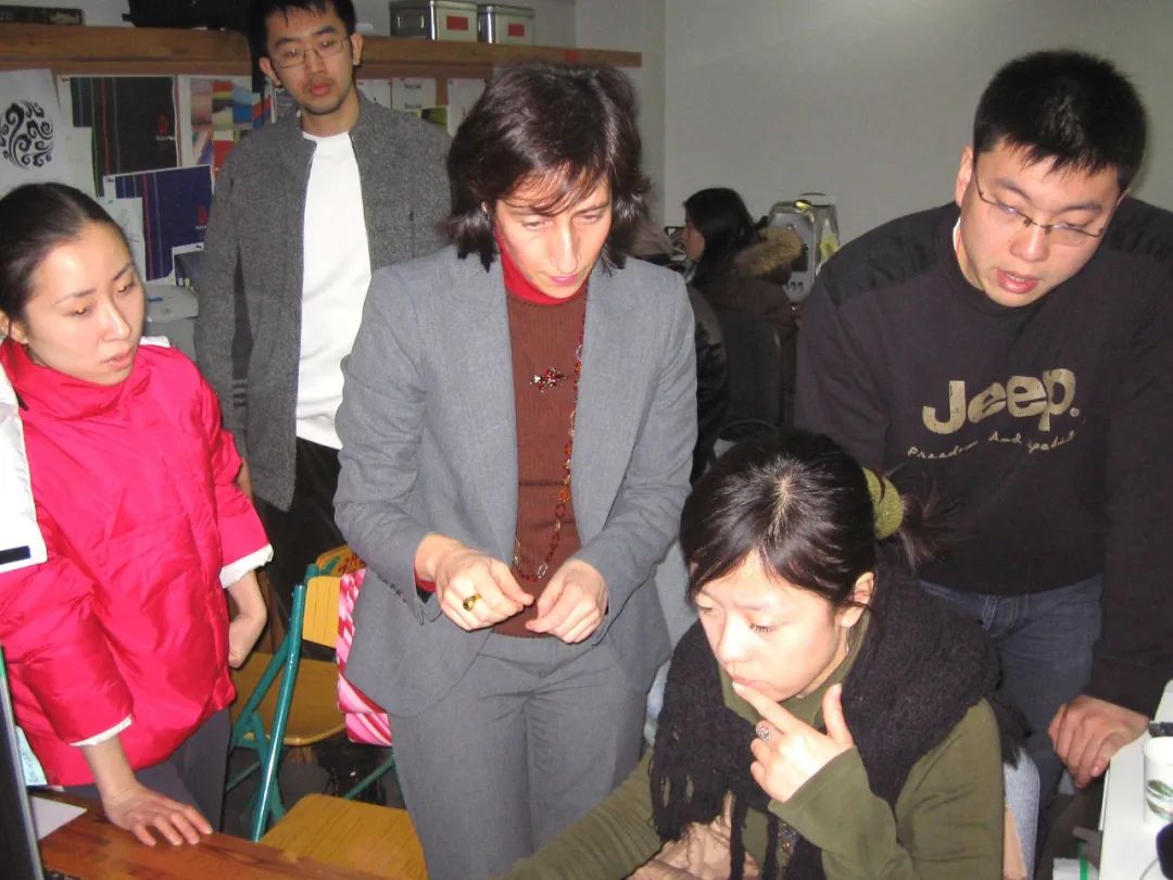
Theodora Mantzaris instructed the BOCOG 2008 Team.
西奥多拉·玛莎里斯指导北京2008年奥组委设计团队。
It is very interesting to see that the two identities share the same cultural DNA but they are expressed in a completely different way. They are both borrowing elements from our natural habitat such as clouds, mountains and rivers; elements that were admired in the old, Chinese scroll paintings that back then, were used to express feelings and emotions, reflecting the richness of Chinese philosophy.
很有趣的是,两届同在北京举行的奥运会视觉形象拥有相同的文化基因,但却以完全不同的方式进行表达。它们都是从我们的自然栖息地中借用元素,如云、山、河流等等古代中国卷轴画中所推崇的元素,用于表达感受和抒发情感,反映了中国哲学的丰富性。
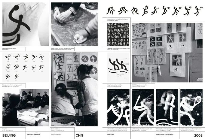
A page from Olympic Games – The Design
《奥运会——设计》中关于北京2008年奥运会体育图标设计的页面
Source/来源: https://www.theolympicdesign.com
When you are faced with the two secondary graphics you may even experience the difference in temperature of the environment they convey. The Beijing 2008 Lucky Cloud graphic creates a clear and warm summery atmosphere full of optimism for the future. The Beijing 2022 Mountains and Rivers graphic, on the other hand, is cool, inspirational and peaceful. Both visual identities are very appropriate for the respective Olympic Games. They are both engraved in all of our minds, the Nation attributes of Culture, respect to Olympic values and the welcoming Chinese spirit that is so unique and so giving. The Beijing 2008 Olympic Games showcased China honouring Olympism, a country that is open and friendly. The Beijing 2022 Winter Olympic Games presented a China that is peaceful but also a leader in the world of winter sports.
当面对两届奥运会不同的视觉形象图形时,你甚至可能会体验到它们所传达的环境温度差异。2008年“祥云”图形营造出清晰温暖的夏日氛围,对未来充满了乐观。2022年“山水”图形则酷炫、鼓舞人心、宁静祥和。这两种视觉形象都非常适合各自的奥运会。中国文化的民族属性、对奥林匹克价值观的尊重以及如此独特、如此热情好客的中国精神,它们都铭刻在了我们所有人的脑海中。北京2008年奥运会展示了中国是一个尊重奥林匹克精神,开放并友好的国家。北京2022年冬奥会展现了一个和平美好的中国,同时也是世界冬季运动的引领者。
Q
During the period of Beijing 2022 Olympic Winter Games, Bing Dwen Dwen as the mascot went viral in China, do you think it has fulfilled its function and what do you think of this phenomenon?
2022年北京冬奥会期间,冰墩墩作为吉祥物在中国风靡一时,您认为它是否发挥了相应的作用,您如何看待这一现象?
Theodora Mantzaris: Mascots are very important applications in the Olympic Games visual identity. They are great ambassadors to the Olympic Games especially to young people. Mascots present the most approachable communication channel and have the power to move our hearts and minds. Very few mascots are truly successful and stand the test of time. Bing Dwen Dwen is one of them.
It is the first Olympic mascot to go viral and to be adored by so many people. Bing Dwen Dwen is a Panda, an animal that one can only love. The intelligent designer added the “sugar coating finish” and the ability to fly, move in space, and connect with everyone in every Nation. This is the power of good, effective and intelligent design. The power to unite millions of people to express their participation in the Olympic Games and celebrate Olympic values.
西奥多拉·玛莎里斯:吉祥物是奥运会视觉形象中非常重要的应用。它们是奥运会的形象大使,尤其是对年轻人而言。吉祥物提供了最平易近人的沟通渠道,并且有能力打动我们的心灵。很少有吉祥物获得真正意义上的成功并经得起时间的考验,冰墩墩就是其中之一。
它是第一个迅速走红并受到这么多人喜爱的奥运吉祥物。冰墩墩是一只熊猫,一只人见人爱的动物。聪慧的设计师为它添加了“糖衣饰面”和飞行的能力,它能在太空中移动并与每个国家中的每个人相联系。这就是优秀、有效和智能设计的力量,也是团结数百万人表达他们对奥运会的参与和弘扬奥林匹克价值观的力量。
Q
What do you think is the breakthrough in the visual identity of the Beijing 2022 Olympic Winter Games from the history of Olympic Design? Do you think it will exert any influence on the future design of Chinese national image? Why?
您认为北京2022年冬奥会和冬残奥会的视觉形象设计在奥运设计史上有什么突破吗?这会对未来中国国家形象的设计产生影响吗?为什么?
Theodora Mantzaris: Every Olympic Games has the power to move the Host City and Host Country forward. They signify a period in time that the Nation, alongside other considerations, is striving to align its efforts with the essence and values of Olympism. The Beijing 2008 Olympic Games presented a vivid example. The visual identity produced was the first in China in that scale, that demanded alignment of so many items, applications, electronic, printed spaces, all required for an effective Olympic visual identity delivery.
Apart from the amazing visual identity, there is a vast amount of infrastructure projects, design projects at large, landscaping design, architectural design and other designs that took place during and after the Olympic Games that transformed Beijing into a green, a well designed modern and functional Metropolis.
The Beijing 2022 Winter Olympic Games presented a solid visual identity, that was derived from a strong team, again, powered by CAFA. This time the design work is more mature because it conveys the intelligence that derives from experience and talent combined. The design work at large influenced all aspects of design, leaving a valuable legacy in the local and global design community, and all together placed the country in the map of leaders in the world of winter sport. A great team of brilliant designers and officials working in harmony moving not only China but also the Olympic Movement forward.
西奥多拉·玛莎里斯:每届奥运会都会产生推动主办城市和主办国家发展前进的力量。它们标志着一个时期,主办国家及时综合考虑其他因素,共同努力与奥林匹克精神的本质和价值观保持一致。北京2008年奥运会就是一个生动的范例,它所产生的视觉形象是第一次在中国以如此大规模的形式,对应如此多的项目、应用程序、电子化和发布空间等,所有这些都是有效的奥运视觉形象传达所必需的。
除了令人惊叹的视觉形象外,还有大量的基础设施项目、大型设计项目、景观设计、建筑设计和其他在奥运会期间和之后进行的设计,将北京变成了一个绿色环保并设计精良的现代化和功能性大都市。
北京2022年冬奥会呈现出坚实的视觉形象,这源于一支强大的团队,再次由中央美术学院提供支持。这一次的设计作品更加成熟,因为它传达了来自经验和才能结合的智慧。整个设计项目的工作影响了设计界的方方面面,在中国和全球设计界都留下了宝贵的经验和传承。一个由优秀设计师们和官员们组成的伟大团队协同工作,不仅推动了中国的进步,也推动了奥林匹克运动的发展。
Q
“Winter Dream”, the emblem of Beijing 2022 Olympic Winter Games, behind Big Air Shougang during the competition of Ski Jumping has become one of the most recognizable identifications, which also encouraged the public to rethink its significance. It is not always easy to make a balance between the artistic quality and public perception, thus what do you think of the relation between contemporary art design and popular aesthetics from the perspective of Olympic Design History?
北京2022年冬奥会会徽“冬梦”在首钢滑雪大跳台“雪飞天”进行的各项比赛中成为了最具辨识度的标识,也促使公众重新思考其意义。在艺术品质和公众认知之间取得平衡并不容易,那么从奥林匹克设计史的角度,您如何看待当代艺术设计与流行美学的关系?
Theodora Mantzaris: The Beijing 2022 Winter Olympic Games Emblem “The Winter Dream” has left a lasting impression to me. It attracted my attention from the first second I saw it. I was confident that this is the best Emblem to represent the Beijing 2022 Winter Olympic Games.
It combines traditional and modern elements of Chinese culture and embodies the passion and vitality of winter sports. It is inspired by 冬, the Chinese character for “winter” and it resembles an ice skater at the top and a skier at the bottom. The flowing ribbon-like motif between them symbolizes the host country’s rolling mountains and Olympic venues.
西奥多拉·玛莎里斯:北京2022年冬奥会会徽“冬梦”给我留下了深刻的印象。从我看到它的那一刻起就吸引了我的注意力。我坚信这是代表北京2022年冬奥会的最佳会徽。
它融合了中国文化里传统与现代的元素,体现了冬季运动的激情与活力。它的灵感来自于“冬天”的汉字“冬”,它的姿态如同一个滑冰者在顶部,一个滑雪者在底部。它们之间流动的丝带状图案象征着主办国连绵起伏的山脉和奥运场馆。

The Beijing 2022 Winter Olympic Games Emblem “The Winter Dream”
北京2022年冬奥会会徽“冬梦”
It is a multi layered Emblem full of meaning. It focuses on the endeavor of the athlete, and makes it a fundamental element in its design grid. It is an Emblem that works seamlessly in all applications. It offers great opportunities for broadcasting and photographic frames with the athletes next to its fluid shapes.
The calligraphic expression of the Olympic Games signature is also very elaborate, well-crafted and in visual alignment to the rest of the Emblem. A unique choice, distinct, very Chinese, in its visual communication especially when used in isolation. This is an Emblem that was made by a designer with great skill and attention to detail. It is easy to understand that it was crafted for very many days and every line drawn, every colour chosen, were put in place wisely.
The Olympic Games are a Celebration of Humanity. It is during the Olympic Games one can see in reality and in practice how sacred the Emblem is and how valuable it is in all of our minds. All of us want to be connected with it and we all know that its meaning and significance will create treasured memories reflecting the power of Olympism servicing humankind. These captured images of athletes in front of it, offer a unique experience; a glimpse into how wonderful the world can be when we live in harmony together. When we do our best in life and in the stadiums, when we respect each other and live life in peace. Winter dream is an exceptional Olympic Emblem. It is very lyric and artistic; it speaks an international visual language. These images created with this iconic statement will stay in the memory of humanity for ever.
它是一个充满意义的多层次会徽。它聚集了运动员的努力,并使其成为其设计网格中的基本元素。它是一个可以在所有应用程序中无缝运行的标识。它流畅的图形伴随着运动员竞技,也在电视直播和摄影框架中提供了绝佳的展示机会。
冬奥会印鉴的书法表达也非常精致,制作精良,与会徽的其余部分在视觉上对齐。它的视觉传达独一无二并非常中国化,尤其是在单独使用时。这是由一位技术精湛且注重细节的设计师创作的会徽。它易于被理解,通过精心制作,每一条线,每一种选择的颜色,都被巧妙地放置在了恰当的位置上。
奥运会是全人类的盛会。在奥运会期间,人们可以在现实情况中看到会徽是多么神圣,它在我们所有人的心目中是多么宝贵。我们所有人都想与它建立联系,我们都知道它的意义和重要性,将创造珍贵的记忆,反映奥林匹克精神为人类服务的力量。这些通过摄影捕捉到的运动员在会徽前的图像,提供了一种独特的体验;当我们和睦相处时,当我们在生活和赛场上拼尽全力时,当我们相互尊重并和平地生活时,世界会变得多么美好。“冬梦”是一个杰出的奥林匹克会徽。它非常抒情和艺术化;它使用着一种国际视觉语言,这一标志性的创作将永远留在人类的记忆中。
Q
Elements extracted from Chinese scroll paintings, were uniquely applied to fences around the ice arena for figure skating, short track speed skating. They looked fascinating when the athletes moved with them changing behind. The design is regarded as another highlight in Beijing 2022 Olympic Winter Games as it perfectly combined Eastern philosophy with Olympic elements. In addition to this, what do you think are the top three most significant examples during the interactive progress between the Olympic Design History originally from the West and Chinese Olympic Design according to your previous working experience?
从中国长卷山水画中提取的元素,也被独特地应用于本届冬奥会赛场的围挡上。当运动员们仿佛“人在画中游”时,画面与场景看起来非常美。该设计将东方哲学与奥运元素完美结合,成为北京2022年冬奥会的又一亮点。除此之外,根据您以往的工作经验,您认为西方奥运设计史与中国奥运设计互动进程中最重要的三个典范是什么?
Theodora Mantzaris: The Beijing 2022 Olympic Games brand identity design system is very modern, sharp and full of cultural references. The mountains and rivers graphic is inspired by masterpieces of Chinese scrolls. Scrolls full of poetic, cultural and philosophical connotations. The open horizon and mountain peaks, the flow of rivers, are a reflection of the old scrolls but they create a modern, dynamic yet idyllic setting for the Olympic Rings to be placed and highlighted in the venues. The colours were selected to reflect Chinese traditional hues and they have been adjusted to be broadcast friendly.
西奥多拉·玛莎里斯:北京2022年冬奥会形象景观的设计体系非常现代、犀利且充满了文化借鉴。山水图形的灵感来自多幅古代中国长卷绘画,充满着诗意、文化和哲学的内涵。开阔的地平线和山峰,河流的连绵不绝,是古水墨卷轴的意像,但它们为奥运五环在场馆中的放置和强调,创造了一个现代、充满活力而又田园诗般的环境。色彩的选择反映了中国传统色调并经过调整以适应电视直播。
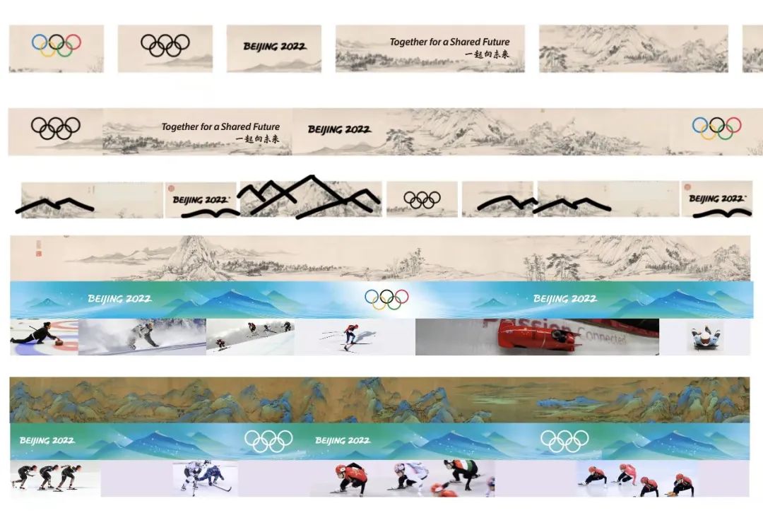
Graphic Design for Olympic Rings, Courtesy of Lin Cunzhen and the Design Team
北京2022年冬奥会奥运五环平面设计
图片由林存真及设计团队提供
What is exceptionally intelligent is that this graphic is in a linear form. Just like in the old traditional scrolls, the image of the Mountains and Rivers are in this format. The format of most applications in the Field of Play and in the Look of the Games. Another stroke of brilliance in the choice and expression of this secondary graphic. It is very important to know how this secondary graphic will be eventually applied when you first design it at the beginning of the visual identity project.
The snowflakes offered tremendous visual communication oportunities not only in the Look of the Games but also in the Olympic Games engagement front, with an interactive application to make your own personal design of the snow flake. In the Opening Ceremony these snowflakes presented the names of the Nations in the Athletes Parade and then all together created the Olympic Cauldron, a spectacular alignment visual iconography. The detail of the Great Wall, signals the characteristic landmark of the host City, a visual signature that gives to all applications and the Look of the Games a distinct locality that is so easy to understand today and to remember in the future.
The mountains and rivers graphic is also an Olympic first because it is animated in a rhythmical way, pleasing to the eye when broadcasted and when used in different applications. This animation was the first image we enjoyed during the first moments of the global broadcast of the Opening Ceremony, a great introduction for the rest of the visual identity that was about to be revealed during the next days of competition.
All work produced by the Beijing 2022 Winter Olympic Games will prove to leave a lasting legacy also in Olympic design, placing it among the great examples of design produced for the Olympic Games.
My other personal favourite design systems, (apart of the obvious choice of the Athens 2004 Olympic Games) are the ones from Mexico1968 and Los Angeles 1984 Olympic Games.
在这个设计中非常精妙的是,图形是线性的,就像中国传统水墨画一样,山河的形象都是这种格式,赛场和比赛景观中大多数应用程序的格式在这个辅助图形的选择和表达中再一次精彩纷呈。
核心图形“雪花”也提供了很棒的视觉交流呈现,不仅体现在冬奥会的外观上,而且表现在冬奥会的参与方面,通过交互式应用程序来制作自己的雪花设计。在开幕式上,另一种雪花图形设计也在开幕式运动员进场时展示了国家的名字,然后共同组成了奥林匹克主火炬,这是一个壮观的视觉图像。长城的细节,标志着主办城市的标志性地标,为所有应用程序和奥运会外观提供了一个独特的在地性,现在很容易理解,未来也很容易记住。
“山水”图形也是奥运首创,因为它是通过有节奏的方式进行动画处理,不管是在直播时还是在不同应用中使用都令人感到赏心悦目。这部动画也是我们在冬奥会开幕式进行全球直播时第一时间欣赏到的第一个意像,也为接下来在比赛中即将揭晓的其他视觉形象进行了精彩的介绍。
北京2022年冬奥会的所有设计都将在奥运设计史中留下持久的影响,使其成为奥运会设计的典范之一。
我个人比较偏爱的其他设计体系(除了2004年雅典奥运会),是1968年墨西哥城奥运会和1984年洛杉矶奥运会的设计系统。
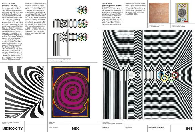
A page from Olympic Games – The Design
《奥运会——设计》中关于1968年墨西哥城奥运会设计的页面
Source/来源:https://www.theolympicdesign.com/
Mexico 1968 is a magnificent visual identity full of energy and movement. The design system introduced the language of stripes in sports graphics in combination with a set of strong visual national cultural references. Mexico shaped and presented the latest in design at the time, as applied in all its sectors, graphic, fashion, product, architecture and other. An Olympic Games visual identity that defined design in the 60’s and 70’s.
“墨西哥1968”是一个充满活力和动感的宏伟视觉形象。该设计系统中引入了运动图形中的条纹语言,并结合了一组强烈的视觉民族文化借鉴。1968年墨西哥城奥运会塑造展示了当时最新颖的设计,并应用于其所有领域包括图形、时尚、产品、建筑等。作为奥运会的视觉标识,它定义了二十世纪六十和七十年代的设计。
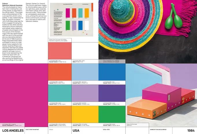
A page from Olympic Games – The Design
《奥运会——设计》中关于1984年洛杉矶奥运会设计的页面
Source/来源: https://www.theolympicdesign.com/
Los Angeles 1984 was also full of cultural references, reflecting American culture, with a fantastic expression of Memphis design and the most advanced and lively Look of the City that has not been challenged yet. A true brilliant system of a flexible visual identity that transformed LA into a great Olympic City full of joy and fun celebrating Olympic values.
1984年洛杉矶奥运会也充满了文化借鉴,反映了美国文化,孟菲斯设计的奇妙表达和当时尚未受到质疑最先进和最活泼的城市景观。一个真正出色并灵活的视觉形象景观系统,将洛杉矶变成了一个充满欢乐和弘扬奥林匹克价值观的伟大奥林匹克之城。
Q
Have you noticed any introduction of advanced design technologies in Beijing 2022 Olympic Winter Games? What do you think of the future influence of Beijing 2022 Olympic Winter Games on following ones from the perspective of design?
您是否注意到北京2022年冬奥会和冬残奥会引入了哪些先进的设计技术?您如何看待北京2022年冬奥会设计对未来的影响?
Theodora Mantzaris: The Beijing 2022 Olympic Games projected the country’s ability to be a major player in the Winter sport industry. Every single detail projected excellence and innovation in design. But what I think is so unique to these Olympic Games is the inbuilt humanity in the design system. I think this is the legacy that Beijing 2022 offered, a legacy that is so peaceful, so strong at the same time and so much needed in our world today.
The sport pictograms are ground breaking and a great addition to the Olympic Games pictograms collection as they were used in all digital applications with such great success. The 24 pictograms for the Beijing 2022 Winter Olympic Games, have been inspired by the art form of traditional Chinese seal engravings. They identify each of the disciplines across the seven Olympic winter sports. Freestyle skiing and snowboarding are allocated six and five icons respectively due to differences in the equipment and courses used.
Each of the pictograms depicts its respective discipline with unique strokes - like those carved with a knife on Chinese seals dating back to the Qin and Han dynasties. The sharp contrast between the red background and the white strokes also highlights the grace and dynamism of winter sports and they work in harmony on the Mountains and Rivers graphic. The pictograms embody the correct motion of each of the winter sports and confirms China’s rich culture and leading position in the world of graphic design.
西奥多拉·玛莎里斯:北京2022年冬奥会展示了中国成为冬季运动行业主要参与者的能力。每一个细节都体现了设计的卓越和创新。但我认为这届冬奥会的独特之处在于设计系统中内在的人性。我认为这就是北京2022年冬奥会留下的传承,如此和平、同时又如此强大、我们当今世界非常需要的传承。
奥运体育图标具有开创性,是奥运会图形系统的重要补充,因为它们在所有数字应用中都取得了巨大成功。北京2022年冬奥会的24个体育图标从中国传统篆刻艺术形式中汲取灵感。他们代表了冬季奥运会七大项下的分项。自由式滑雪和单板滑雪由于使用的设备和路线不同,分别配了六个和五个图标。
每个体育图标都以独特的笔触描绘了各自的类别——就像那些用刀在秦汉时期的中国印章上雕刻的那样。红色底色与白色笔触的鲜明对比,也凸显了冬季运动的优雅与活力,在山水图形上相得益彰。体育图标体现了每一项冬季运动的正确动作,印证了中国丰富的文化和在世界平面设计中的领先地位。
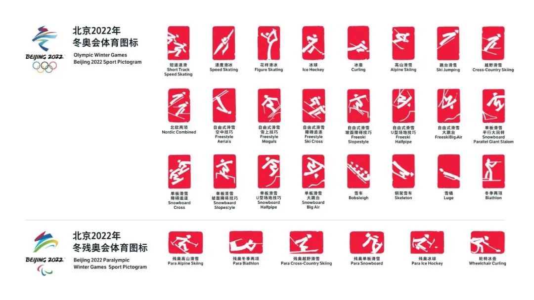
Sports pictograms for 2022 Winter Olympics in Beijing,
北京2022年冬奥会体育图标
Source/来源: Chinadaily 《中国日报》
The pictograms are also animated to the sound of Chinese drums, an upbeat rhythm full of energy almost like an uplifting heartbeat. Even though everyone was under tremendous time pressure because of the thousands of applications that needed to be created and produced, the team showcased their passion for excellence and delivered pure graphic design brilliance. I believe that these pictograms are iconic examples that future OCOGs have a lot to learn from.
Last but not least, the Look of the Games looks stunning in the venues but it looks fantastic on screen. With the invaluable assistance of OBS, the Beijing 2022 Winter Olympic Games Look of the Games is broadcasted around the world bringing the magic of the Olympic Games in our homes.
The Olympic Games, Olympism, the Olympic Ideals after their centuries long journey, were honoured for the second time in Beijing. This universal philosophy of life served humankind once again, through the athletes, the heroes of the Olympic Games, the global Olympic family but also through the visual identity and Look of the Games, created by the most talented and artistic team.
I am certain that the Beijing 2022 Olympic Games visual identity and Look of the Games will be considered as one of the most treasured in the Olympic Movement.
体育图标也随着中国鼓的声音而灵动,充满活力的乐观节奏几乎就像令人振奋的心跳。尽管由于需要创建和制作数千个应用程序,每个人都承受着巨大的时间压力,但整个设计团队展示了他们对于卓越的热情追寻,并不负众望地交付出纯粹而卓越的平面设计。我相信这些体育图标是标志性的范例,也值得未来的奥组委学习和借鉴。
最后但同样重要的是,北京2022年冬奥会的外观在场馆中看起来令人惊叹,在屏幕上看起来更棒。在奥林匹克广播服务公司极宝贵的协助下,北京2022年冬奥会现场直播得以在全球播出,将奥运的魔力带入我们的家中。
奥林匹克运动会,奥林匹克精神,奥林匹克理想经过数百年的征程,在北京再次收获荣光。通过运动员、奥运会英雄、全球奥林匹克大家庭,以及由最有才华和艺术性的团队创造奥运会视觉形象景观,而共同再次为人类服务。
我敢肯定,北京 2022年冬奥会的形象景观将被视为奥林匹克设计中最珍贵的财富之一。
Q
You have mentioned that CAFA (Central Academy of Fine Arts) was a special university for you. Could you explain the reason? And how do you think of the development in design education at CAFA over the past decade? Would you like to give any suggestion for young designers in China?
您曾提到中央美术学院对您来说意义非凡,为什么?您如何看待中央美术学院过去十年中设计教育的发展?您对中国的年轻设计师有什么建议吗?
Theodora Mantzaris: The Central Academy of Fine Arts is the best Art and Design University in China and it is considered one of the best in the world. Every year a new team of students graduate with portfolios that are wonderful and full of new and innovative ideas confirming the fact that this University is a massive power house of creativity with vast amounts of potential to make our world a better place.
During the creative process of the Beijing 2008 Olympic Games, I collaborated and met with so many great Professors that inspired me. I have learned a lot from them because they introduced me to the wealth and depth of Chinese culture. Additionally, through the Professors’ work I was initiated to a new way of thinking, a completely different world that is very contemporary, full of meaning and ideas deriving from Chinese philosophy.
The Beijing 2022 Winter Olympic Games will be considered as the new blueprint to guide the next generations of designers when working on any future Winter Olympic Games design projects. A blueprint that was led by a CAFA Professor Lin Cunzhen, supported by the gigantic assistance of the University and its Research Center for the Olympic Games, the unique place in the world that students and all can get invaluable knowledge about the Olympic Games design history. China entrusted CAFA shape its distinctive and truthful national attributes into two Olympic Games visual identities. CAFA in return delivered Olympic excellence that will stand the test of time.
西奥多拉·玛莎里斯:中央美术学院是中国最好的艺术与设计类大学,也被公认为是世界上最好的大学之一。每年都有一批新的毕业生,他(她)们的作品集非常精彩,充满了新颖和革新的想法,这证实了这所大学是一座巨大的创造力之家,具有使我们的世界变得更美好的巨大潜力。
在北京2008年奥运会的创作过程中,我与许多了不起的教授合作并结识了许多启发我的人。我从他们身上学到了很多,是他们让我了解了中国文化的丰富性和深度。此外,通过教授们的工作,我开启了一种新的思维方式,一个完全不同的世界,非常当代,充满了源自中国哲学的意义和思想。
北京2022年冬奥会将被视为在未来的任何冬奥会设计项目中指导启示下一代设计师的蓝图。由中央美术学院教授林存真领衔的蓝图,受到了来自中央美术学院及其奥运艺术研究中心的大力支持,该研究中心也是世界上独一无二的存在,学生和所有人都可以获得关于奥运会设计史的宝贵知识。中国奥委会委托中央美术学院将中华民族鲜明真实的民族属性塑造成了两个奥运视觉形象。继而中央美术学院也提供了经得起时间考验的奥运卓越品质。
欢迎关注
CAFA ART INFO 抖音号 !

CAFA ART INFO
英文版
Instagram全新上线!欢迎关注!
@artinfo_cafa
https://www.instagram.com/artinfo_cafa/

Facebook/Twitter
国际同步全部资讯
@CAFAartinfo
https://www.facebook.com/CAFAArtInfo
https://twitter.com/cafaartinfo
最新国际月刊已出
订阅请留言
版权声明:所有发表于“中央美术学院艺术资讯网CAFA ART INFO” 中英文版(http://www.cafa.com.cn) 及所属微信公众号“中央美院艺讯网”的内容均应受到国际版权条例的保护,未经授权不得擅自转载使用。
如需申请获得合作授权和内容转载许可,可后台留言“转载”,查看细则并留言联系,或邮件联系editor@cafa.edu.cn(中文)/artinfo@cafa.edu.cn (英文)。获得授权使用的转载,并注明“来源:中央美院艺讯网/CAFA ART INFO)。未经许可不得擅自转载或摘录编改文字和图片,违者本网将依法追究责任。
Copyright notice
© CAFA ART INFO, 2020. All Rights Reserved.
All of the information in the various pages of CAFA ART INFO web site and WeChat is issued by CAFA ART INFO (http://www.cafa.com.cn) for public distribution. It is protected under international conventions and under national laws on copyright. For application of cooperative authorization and reproduction permission, please contact editor@cafa.edu.cn(CN)/artinfo@cafa.edu.cn(EN). Any use of information in the web site or WeChat updates should be accompanied by an acknowledgement of CAFA ART INFO as the source, citing the uniform resource locator (URL) of the article. Unlawful copying and re-using parts of our copyright protected texts and images will result in legal action.

-
阅读原文
* 文章为作者独立观点,不代表数艺网立场转载须知
- 本文内容由数艺网收录采集自微信公众号中央美院艺讯网 ,并经数艺网进行了排版优化。转载此文章请在文章开头和结尾标注“作者”、“来源:数艺网” 并附上本页链接: 如您不希望被数艺网所收录,感觉到侵犯到了您的权益,请及时告知数艺网,我们表示诚挚的歉意,并及时处理或删除。


